Pure Blue
A gamified app empowering communities to fight ocean pollution.

Typography
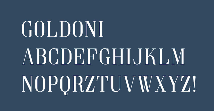
GOLDONI
The main typeface used in the logo, titles, and headlines.
SERIF (regular)
The secondary typeface used in the tagline, captions, and copy

Colors
The main primary colors are found in our logo, pattern, and typeface. The blue color of our brand guide is our main background color(#355170). The lighter blues are used in the Logo, as well as the typeface. For the brand name use #91B8CA, and for the tagline use #37F5FA
#355170
#355170
#355170
Main Logo
What is Pure Blue?
PURE BLUE is an app focusing on raising awareness about ocean pollution and offers simple, actionable steps to help make a difference. It makes volunteering easier and more fun by turning it into a game, motivating users to complete levels and take action. The app also provides educational resources, sustainable living tips with alternative product suggestions, and links to important statistics to help users spread awareness and get involved as a community.

Logo
The beginning C in Chronichat should always be the logo followed by the brand name. When using the horizontal logo, always include our tagline (Connect. Support. Empower.). The Logo is meant to resemble a chain link, symbolizing the connection created between our users. Both the Logo and the main text are Goldoni typeface, and the tagline is in Serif (Roman) typeface.

Pattern

This pattern will be used on branding pieces, specifically packaging. It may only be used in the colors provided.
Packaging

Each user has the option to recieve a welcome box with helpful products based on their chronic illness. The packaging comes in the main blue, covered in our pattern with the logo down the middle.
Inside it it is personalized and welcomes the user to our community.


